
I design products
that make complex things
feel simple
UX Designer with deep roots in product thinking, cross-cultural user research, and systems design. I've taken products from zero to launch, redesigned broken internal workflows, and built interfaces used by real people in real markets.
$1B+
Real estate sold
10+
Audiences targeted
5+
Products Shipped
E2E
Research to handoff
3
Cities · IST · JED · BER
01
Who I am
I think in systems. I design for people. And I measure everything.
My foundation is communication design, how information moves between humans, and how to make that movement feel effortless. Over the years that foundation took me through brand, product, and eventually full ownership of digital experiences used by thousands of people across different countries, languages, and cultural contexts.
I've done the research. Built the wireframes. Shipped the product. Then sat with the data and iterated. I've also managed the teams and the strategy around that work, which means I understand the pressures a product operates under, not just the ideal design conditions.
I design better because I've seen what happens when design and business are disconnected. I've also seen what happens when they align.
02
Case study 01
Role
Solo product designer and founder
Market
Syria · SMBs and buyers
Surface
Mobile marketplace
Output
Research · IA · Flows · Wireframes · Hi-fi · Prototype
Product UX · Mobile · End-to-end ownership
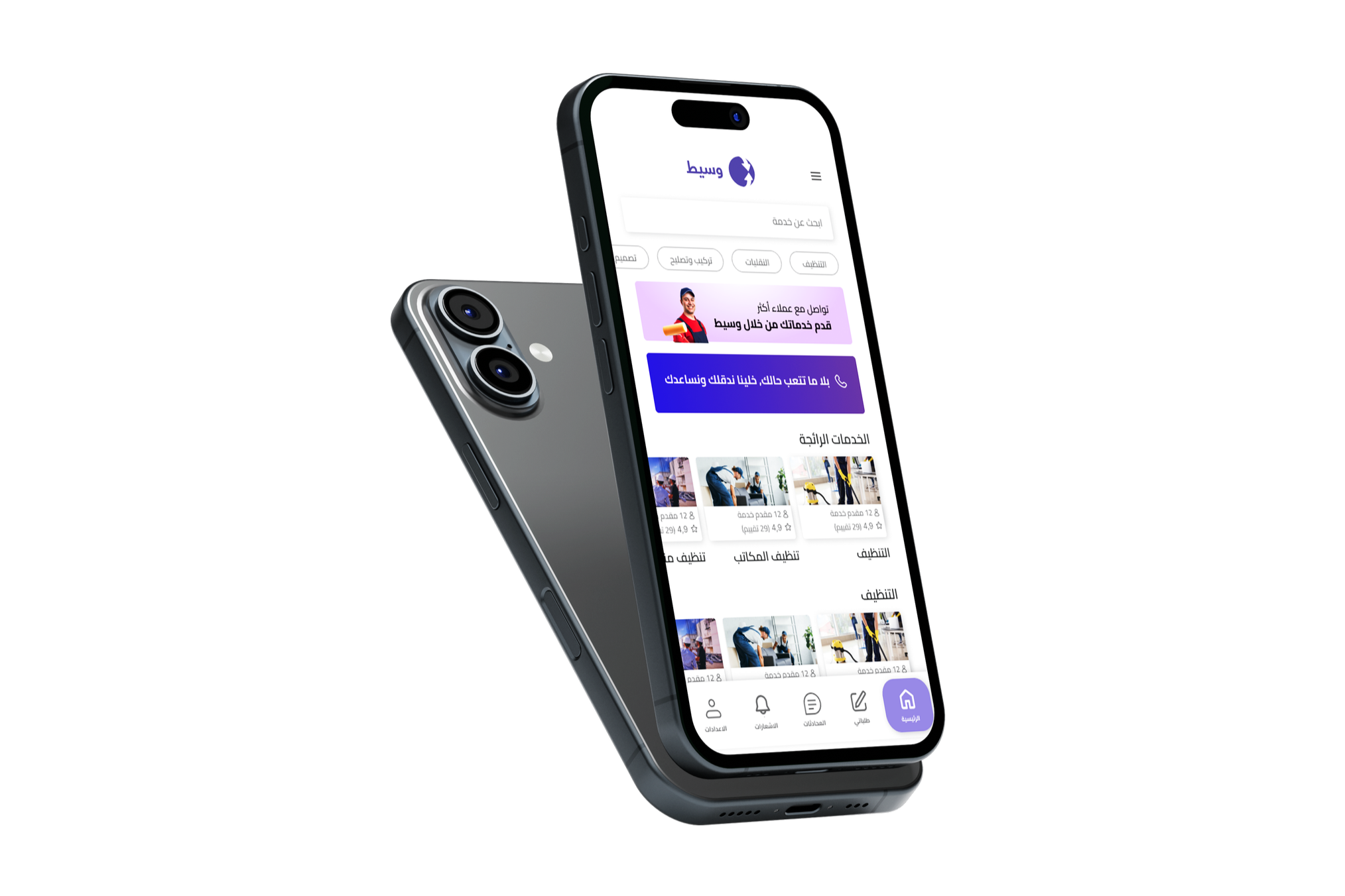
Waseet App:
Designing a marketplace from zero
The problem
Small business owners in Syria lacked a trustworthy, accessible digital marketplace. Existing platforms weren't designed for the behaviors, constraints, or trust patterns of this specific market. Sellers didn't convert. Buyers didn't return.
My role
Solo product designer and founder. I owned every UX decision from discovery through launch.
Discovery & research
Before any wireframe, I needed to understand the people.
I mapped out two distinct user types; sellers (small business owners with low digital literacy and high skepticism) and buyers (looking for local, reliable, fast). I researched their behaviors, their friction points, their existing workarounds, and what made them trust or abandon a platform.
Key findings that shaped the design:
Sellers needed to list in under 3 minutes or they wouldn't bother.
Buyers trusted seller profiles with visible history over anonymous listings.
The local / proximity element was a primary trust signal, not a secondary filter.
The design process
Research → information architecture → user flows → wireframes → high-fidelity UI → prototype → testing → iteration.
From research to information architecture. From IA to user flows. From flows to low-fidelity wireframes. From wireframes to high-fidelity UI. From UI to prototype. From prototype to testing. From testing back to wireframes.
Core design decisions and why:
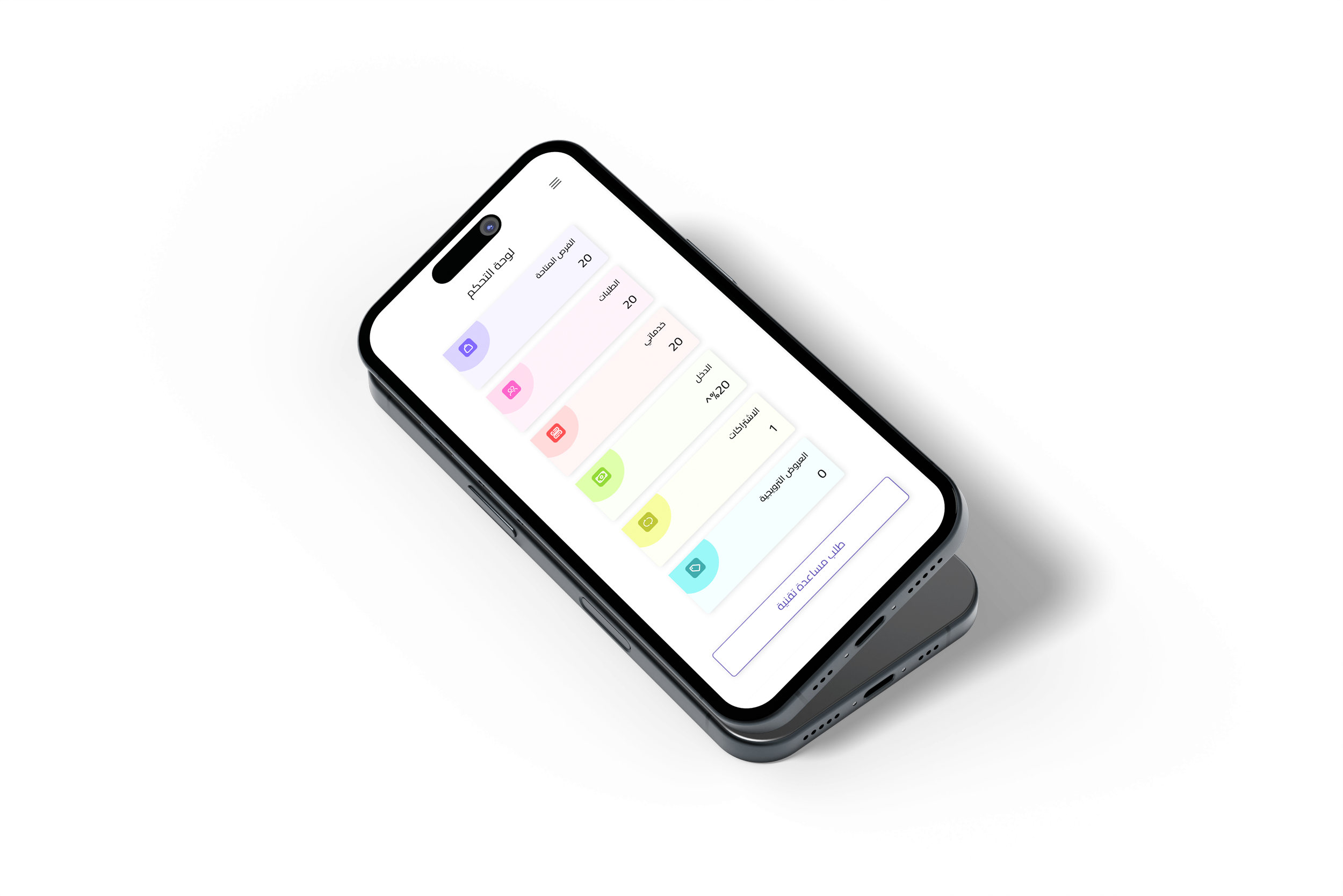
Listing flow reduced to 3 steps based on seller research
Reputation system surfaced on every listing card — not buried in a profile
Proximity-first browsing as the default state, not a filter option
What I learned
Designing for a market you're not physically inside forces rigorous empathy. Every assumption I brought in got tested and most got revised. Building your own product also means you can't blame a bad brief, every poor decision lives in the data and you own it.
This project made me a more honest designer.
03
Case study 02
Role
Head product designer > product manager
Users
Sales team · Sales managers
Surface
Internal web app · Manager dashboard
Output
Team KPIs rose significantly post-rollout
Enterprise UX · Workflow design · Internal product
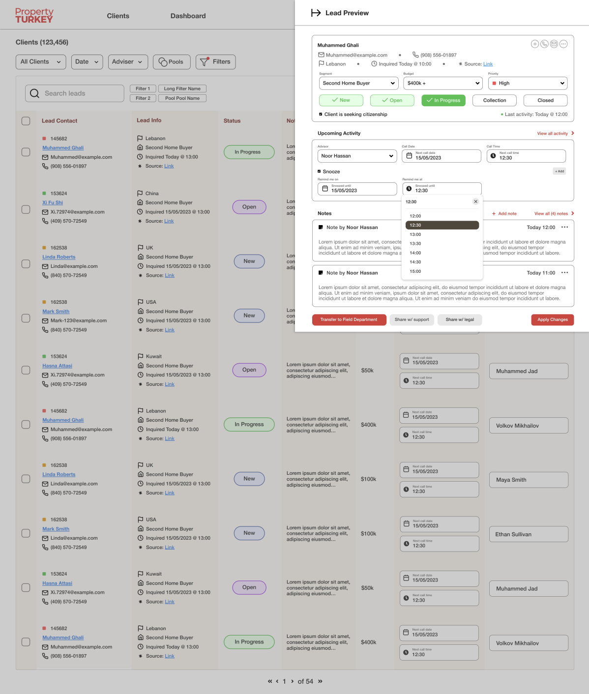
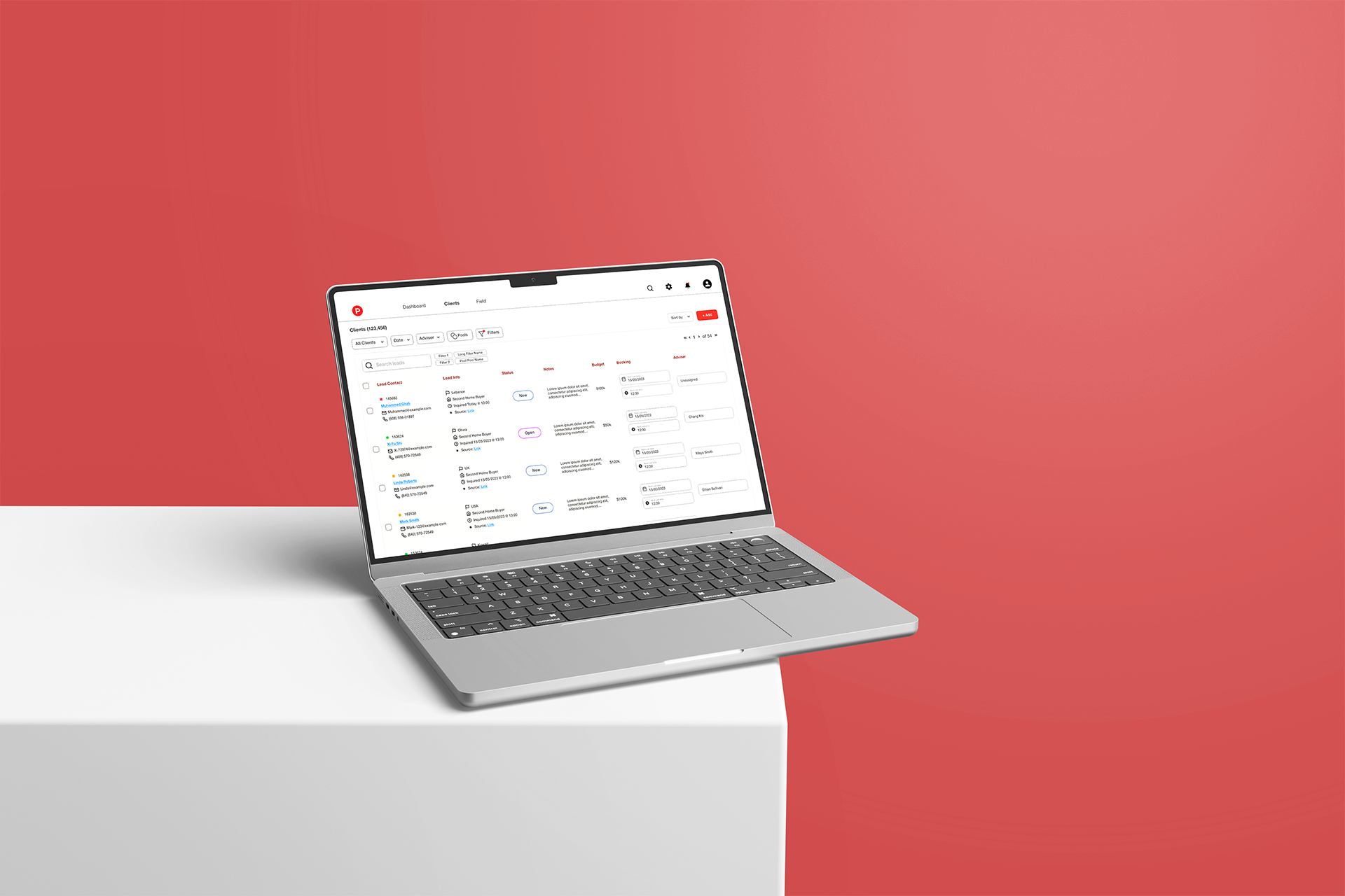
Enterprise CRM:
Internal tooling that Changed How a team worked
Designed during my time as Creative Director / Product Manager at Property Turkey.
The problem
A sales team with no unified system. Leads tracked in spreadsheets. Performance invisible to management. Accountability non-existent. People working hard with no visibility into whether it was working.
This wasn't a productivity problem. It was a design problem.
My role
Solo designer and builder. Took it from problem identification to shipped product.
Understanding the audience
Before touching a screen I spent time with the actual users; the sales team. I needed to understand how they actually worked, not how management assumed they worked.
What I found:
They had 4–5 different tools open simultaneously, constantly context-switching.
Lead status updates were done retroactively, not in real time because updating was more effort than the task itself.
Managers were asking for status verbally because no system gave them confidence.
The design problem became clear: the existing workflow created friction at every step where friction most killed momentum.
The design process
I mapped the full workflow first. Every touchpoint a sales rep had with a lead from first contact to closed deal. Identified where information was getting lost and where effort was being duplicated.
Then I designed around how people actually worked, not around what a CRM is supposed to look like.
Core decisions:
Status updates reduced to a single tap because if it takes longer, it won't happen.
Manager dashboard designed around exceptions, not exhaustive data.
Lead timeline visible to both rep and manager. No more verbal check-ins.
The outcome
KPIs across the team rose significantly after rollout. Not because people were told to perform better because the system stopped working against them.
That's what good internal UX does. It gets out of the way.
04
Case study 03
Role
UI/UX Consultant
Users
Sales team · Sales managers
Surface
Website
Output
200% Surge in bookings and profits
UX Consultation · Website Redesign · Conversion UX
Unique Stays:
When a luxury brand looked anything but…
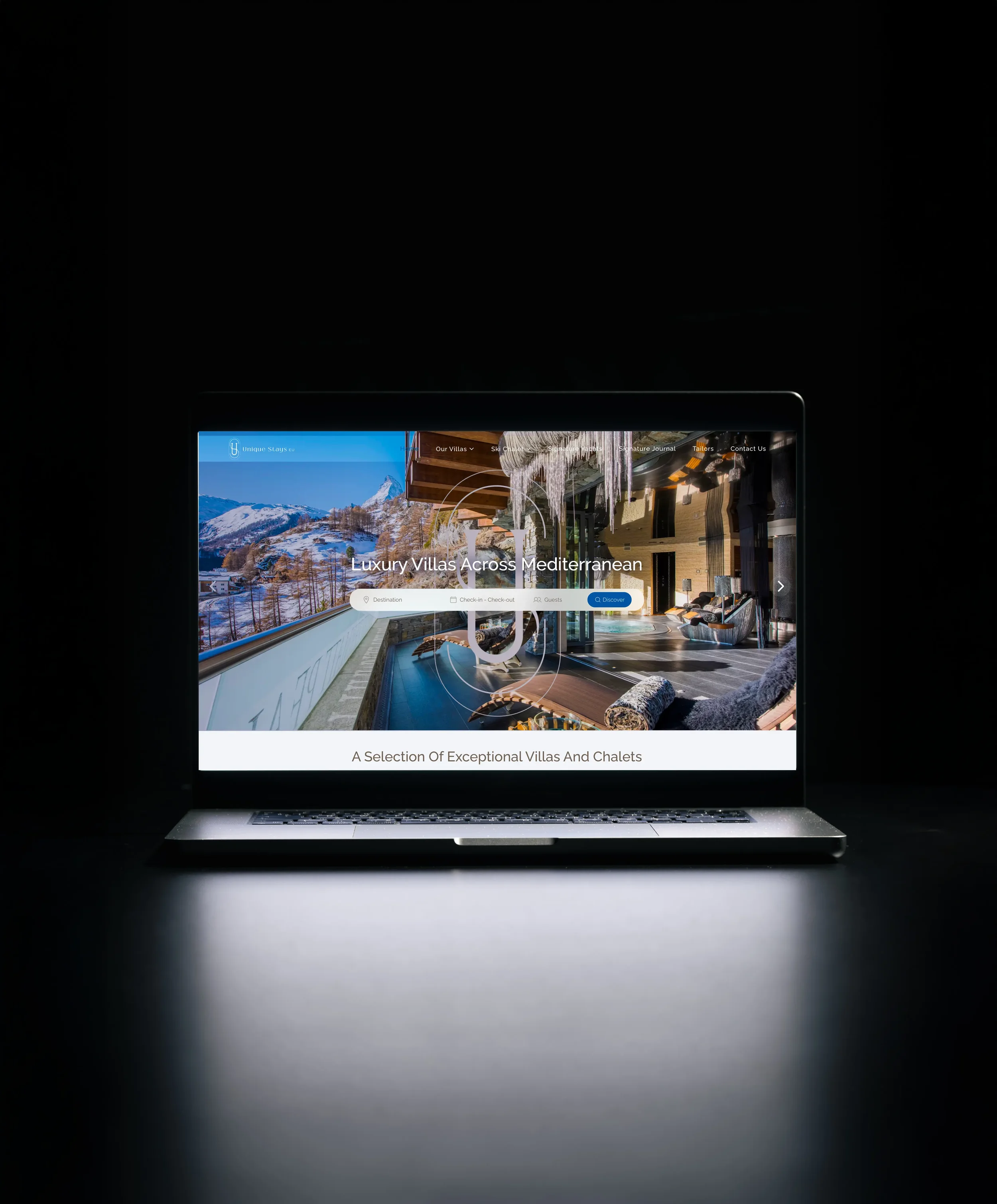
uniquestays.eu · Luxury travel agency
The problem
Unique Stays had everything operationally: a solid booking system, an established marketing engine, a genuinely premium product. But they had no bookings.
The website was the problem. It didn't communicate luxury. It didn't build trust. It didn't convert. Visitors arrived and left without acting, not because the product wasn't right, but because the experience told them it wasn't.
This wasn't a productivity problem. It was a design problem.
My role
UX consultant. I worked directly with their development team over several months; from diagnosis through implementation.
The diagnosis
Before redesigning anything I needed to understand why the experience was failing.
The gap wasn't visual taste. It was the entire logic of how the site communicated value. The information hierarchy was wrong. The trust signals were buried or missing. The booking flow created hesitation at exactly the moments it needed to create confidence.
Luxury UX has a specific grammar: it moves slowly, it shows rather than tells, and it removes every micro-friction that reminds the user they're making a large decision. None of that was present.
The Work
I restructured the information architecture from the ground up. Redesigned the visual hierarchy to lead with experience rather than logistics. Rebuilt the booking flow to reduce decision anxiety at each step. Worked closely with the dev team through every implementation stage to ensure nothing got lost between design and build.
This wasn't a quick rebrand. It was months of careful, iterative work.
The outcome: From zero bookings to fully booked. Approximately 200% surge in booking rate post-launch.
That's not a metric about design aesthetics. That's a metric about trust, and trust is a UX problem.
05
Case study 04
Role
Head product designer > product manager
Users
Property management team · After-Sales team · Sales managers
Surface
Internal web app · Manager dashboard
Output
Team KPIs rose significantly post-rollout
Product UX · Post-sales · Rental & Booking Management
Property Turkey:
Property Management System
Designed for the after-sales department · Property Turkey, Istanbul
The problem
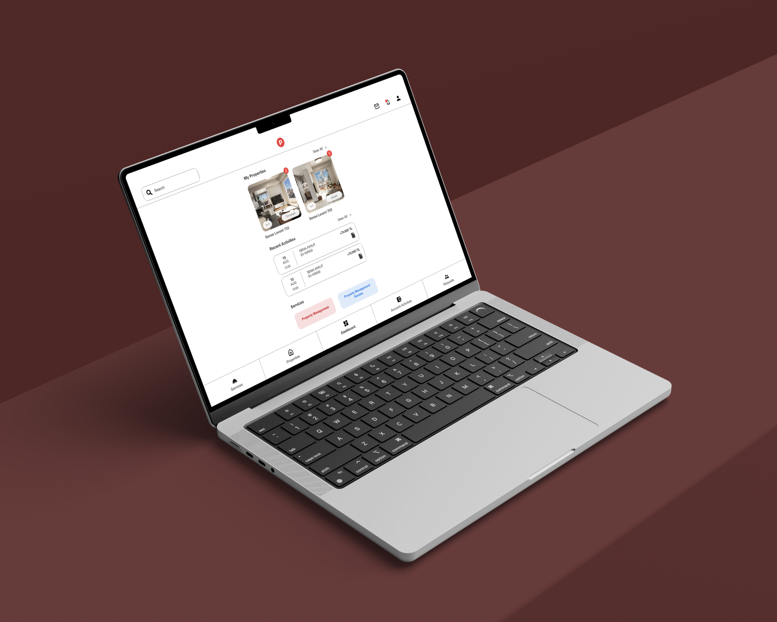
Clients who purchased property through Property Turkey often wanted to rent out their new investments. The after-sales team had no proper system to manage this: rental listings, booking coordination, client communication, and revenue tracking were all handled manually or piecemeal.
It was a real product gap sitting inside an already complex operation.
My role
Designed the full system: from mapping the after-sales workflow to delivering the product interface.
The work
Two user types with very different needs: the internal team managing the rentals, and the property owners wanting visibility into their investment's performance.
I mapped both journeys independently before designing a system that served both: a management layer for the operations team and a client-facing view for property owners to track bookings, revenue, and status without needing to call anyone.
The design priority throughout: reduce the operational load on the team while giving clients enough visibility that they feel in control.
The outcome: Surge in team efficiency and communication, both internal and with clients
06
Case study 05
Role
Head product designer > product manager
Users
Property management team · After-Sales team · Sales managers
Surface
Internal web app · Manager dashboard
Output
Team KPIs rose significantly post-rollout
Website UX · Corporate Credibility · High-stakes Redesign
Power Tower Company:
Redesigning for IPO readiness
Power Tower Company · Saudi Arabia
The problem
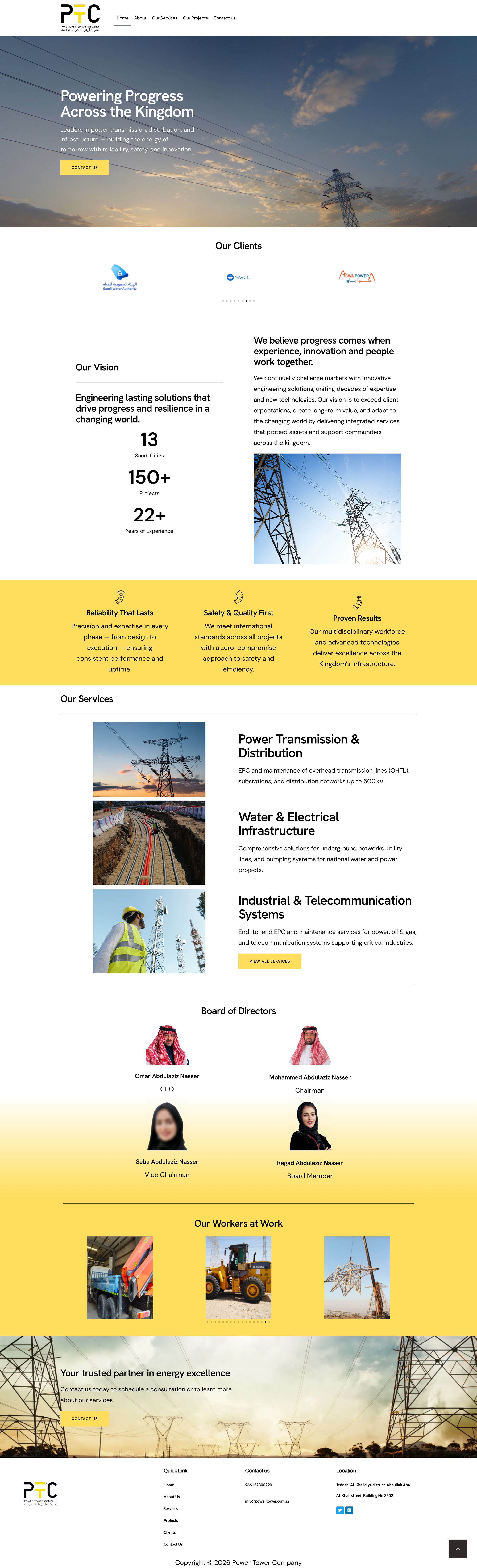
A company preparing for IPO with a website that looked unprofessional. For a business of this scale, that's not a cosmetic issue, it's a credibility issue. Investors, partners, and institutional clients form an immediate judgment. The existing site wasn't making the right one.
My role
Led the full website redesign before the IPO process.
The work
IPO-stage companies need a website that communicates scale, stability, and trustworthiness to a sophisticated audience. Every design decision was made through that lens, information architecture that signals organizational maturity, visual language that matches the company's actual weight, and a user journey built for a decision-maker doing due diligence, not a casual browser.
The outcome: High conversion rate post-launch. Projects worth 35,000,000 SR were signed in the period following the redesign.
07
Case study 06
Role
Web designer
Users
Government Employees · Contractors · Clients
Surface
Website
Output
Team KPIs rose significantly post-rollout
Website UX · Brand Expression
Al-Madar Construction:
Building a brand’s digital presence from scratch
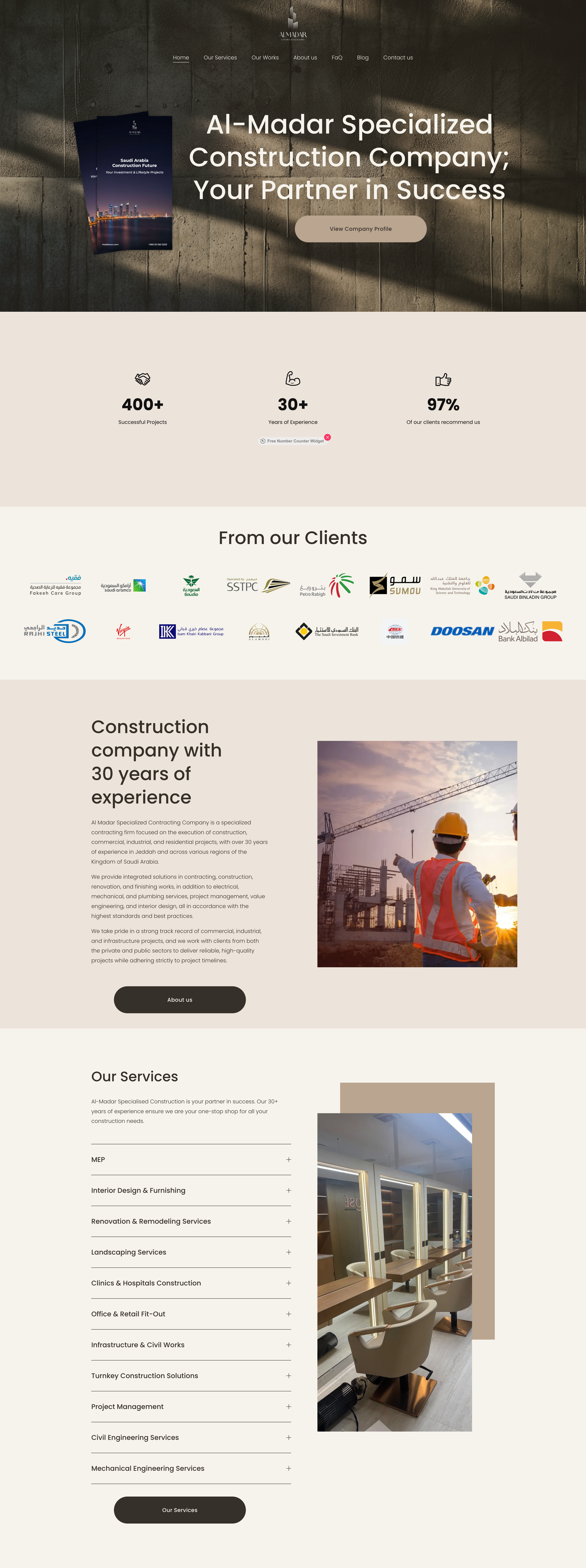
madarscc.com · Saudi Arabia
The problem
No website. No digital presence. A brand that existed in the real world but nowhere online.
My role
Designed and built the website from scratch, from information architecture through final UI.
The work
Starting from zero means every structural decision matters twice, there's no existing audience behavior to learn from, no data to react to. I designed for discoverability, brand clarity, and the specific audience profile of the Saudi market.
The outcome: Strong visit rate and measurable brand visibility growth following launch. A brand that now has a digital presence worthy of the business behind it.
08
Case study 07
Role
Sr. Designer → Creative Director → Product Manager
Market
Istanbul · 10+ buyer nationalities
Surface
Listing pages · Inquiry flow · Comms design
Channel
99% digital
User research · Cross-cultural design · Conversion UX
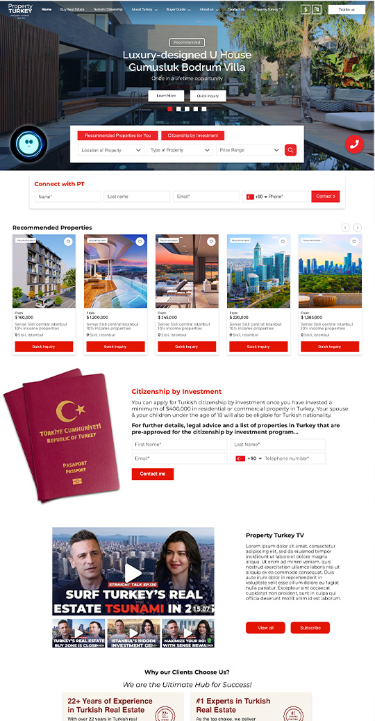
Designing for 10 audiences
simultaneously, at Property Turkey.
propertyturkey.com · Istanbul to the world
The problem
Selling high-value real estate to international buyers who have never visited the country, in their language, in a way that matches their cultural trust signals across ten or more nationalities simultaneously.
This is one of the hardest UX problems I've encountered. The same interface has to work for a Russian investor, a Gulf family buyer, and a European retiree, three completely different mental models of trust, urgency, and decision-making.
The work
I developed segmented user profiles for each major buyer nationality, not just demographics, but behavioral patterns. How they browse. What signals trust to them. What triggers hesitation. What language (literally and tonally) moves them.
That research shaped everything: the information hierarchy on listing pages, the imagery choices, the inquiry flow, the follow-up communication design.
Of over $1B in sales came through the digital channels this thinking shaped
99%
Of leads came through digital marketing. That number lives here, at the end of the story it belongs to, as proof of the design decisions, not as a headline.
08
Process and craft
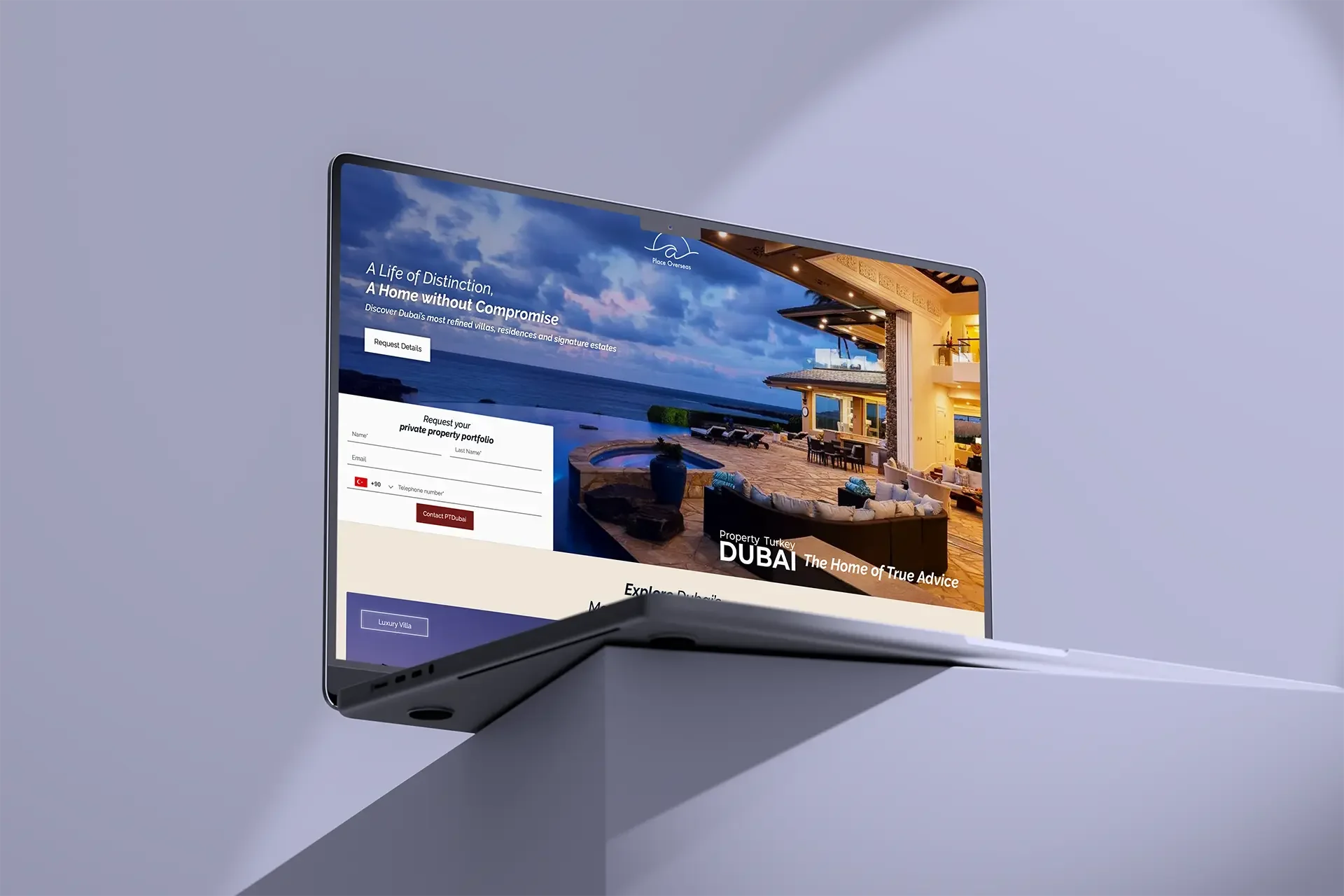
I work across the full UX stack: user research, personas, journey mapping, information architecture, wireframing, high-fidelity UI, prototyping, usability testing, and handoff. Figma is my primary tool and I'm fluent in designing for both mobile and web.
What I care about most is the thinking behind the screen, the decisions that don't show up in a final mockup but determine whether a product works or doesn't.
User research · Persona · Journey mapping · Information architecture · Wireframing · Hi-fi UI · Prototyping · Usability testing · Handoff
09
Other work
01
Printing, in store soon!
The Jungle in My Head
Other things I've shaped, shipped, and stood behind.
My graduation project from Bahçeşehir University. An emotional development book for children. Designed, written, and illustrated entirely by me. It taught me that the best design meets the user exactly where they are emotionally.
02
Marketing, Branding
arthood entertainment
Brand and motion direction for an international film production company.
03
Video Production
Qubba Studios
Video production and commercial storytelling for Gulf brand clients.
"The best UX I've ever done wasn't on a screen. It was in a workflow no one had thought to redesign"
"I've never met a user who was wrong. I've met plenty of assumptions that were"
"A beautiful interface that confuses people isn't design. It's decoration"
Let's talk.
If you're building something users actually rely on and you need a designer who thinks about them first, I want to hear about it.